
USPS
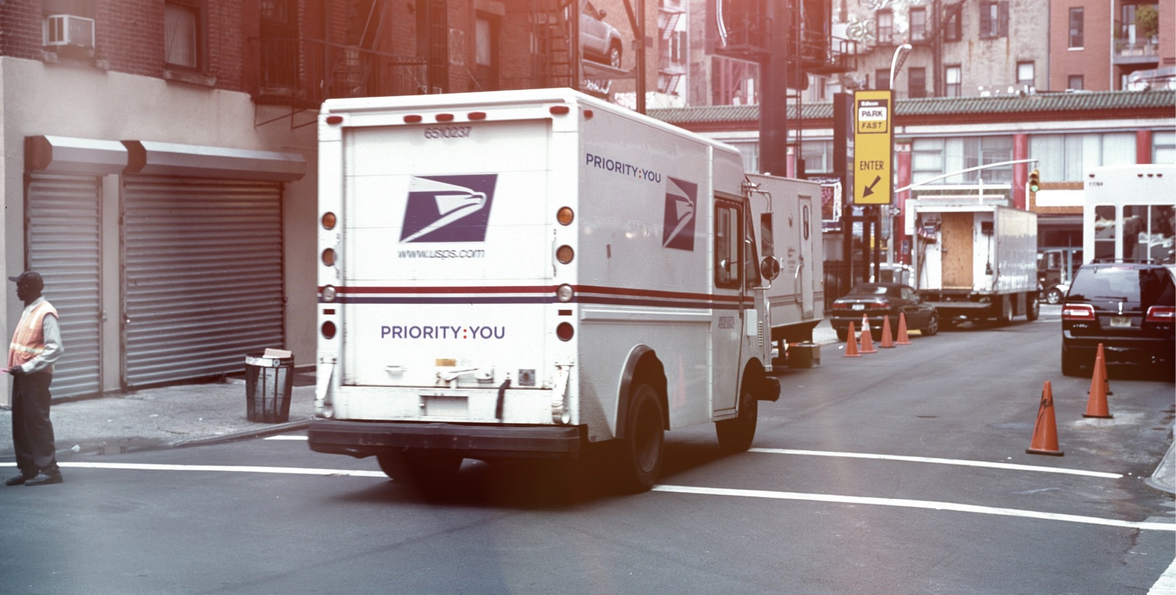
Priority: You
How do you bring a renewed sense of relevance and customer focus to one of America's most recognizable institutions?
At McCann, the creative team developed Priority: You, a campaign platform designed to put customers at the center of the United States Postal Service brand.
Working in close collaboration with the agency's creative team, Brad Blondes and the design team developed the visual identity and design system that gave the platform its distinctive expression. The work established a flexible creative language capable of extending across advertising, packaging, communications, and physical experiences.
Work led by Brad Blondes during his tenure as SVP, Director of Design at McCann, prior to founding 4East.

Giving the idea an identity
A compelling campaign platform needs a visual language that makes it instantly recognizable.
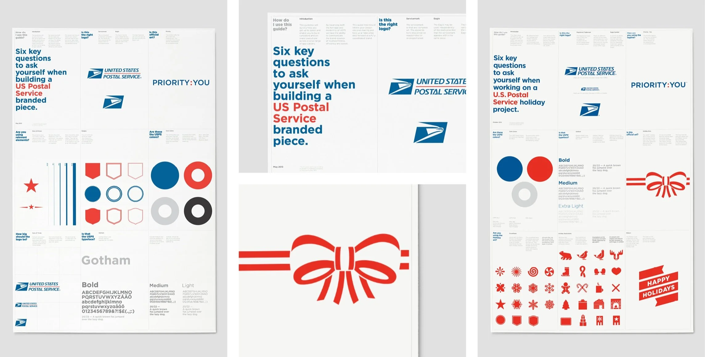
We developed the Priority: You identity around bold typography, a distinctive graphic vocabulary, and a contemporary expression of USPS's established red, white, and blue palette.
The system balanced the familiarity and heritage of the Postal Service with a more expressive, customer-focused design approach, creating a recognizable foundation for communications across channels.
Building a system for everyday interactions
For USPS, the brand lives in millions of everyday interactions, from the packaging customers receive to the materials they encounter at postal locations.
The design system extended across Priority Mail packaging, printed communications, promotional materials, and branded applications, translating the campaign platform into a consistent visual experience.
Guidelines and design principles helped establish how the identity could be applied across different formats while maintaining its clarity and character.

Connecting the brand to its customers
The visual system also supported the broader Priority: You advertising campaign, connecting the platform's customer-first message to the people and experiences behind the Postal Service.
Through typography, imagery, and graphic expression, the identity provided a consistent framework for campaign communications across multiple channels.

Creating new expressions within the system
A strong design system must be recognizable without limiting creative possibilities.
For USPS's holiday initiatives, we developed a distinctive seasonal graphic language that extended the brand into festive packaging and communications while remaining connected to its broader identity.
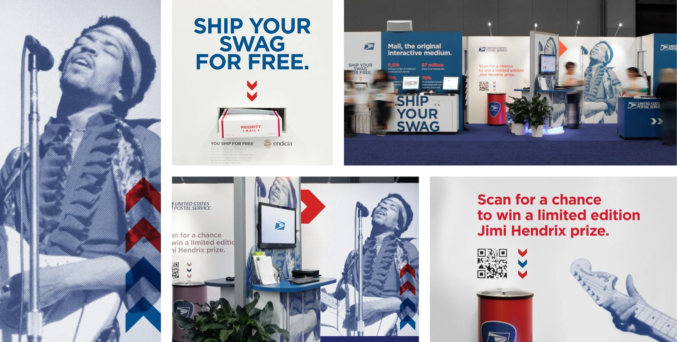
The work also included a Jimi Hendrix-inspired activation at SXSW, demonstrating how the brand could take on a more expressive, culturally relevant character through event graphics, environmental applications, and promotional experiences.
One platform, many possibilities
From everyday packaging to national advertising and cultural activations, Priority: You demonstrated how a single creative platform could support a broad and adaptable system of brand expressions.
The work helped translate a customer-focused campaign idea into a cohesive visual language, connecting strategy, identity, and execution across the many ways people experience USPS.