
MetLife:
Global Brand Localization
A global brand must be recognizable everywhere without looking exactly the same everywhere.
Following MetLife's global brand transformation, a new challenge emerged: how to translate a unified brand identity into distinctive, culturally relevant expressions across markets with different audiences, business needs, and customer expectations.
During his tenure as VP, Global Head of Brand Creative & Design, Brad Blondes helped lead a multi-year brand localization initiative, working with regional teams and creative partners to develop market-specific design systems rooted in MetLife's global identity.
The ambition was to move beyond conventional localization, creating the flexibility for individual markets to express their unique cultural perspectives while remaining part of one connected global brand.
Work conducted during Brad Blondes' tenure at MetLife, prior to founding 4East.


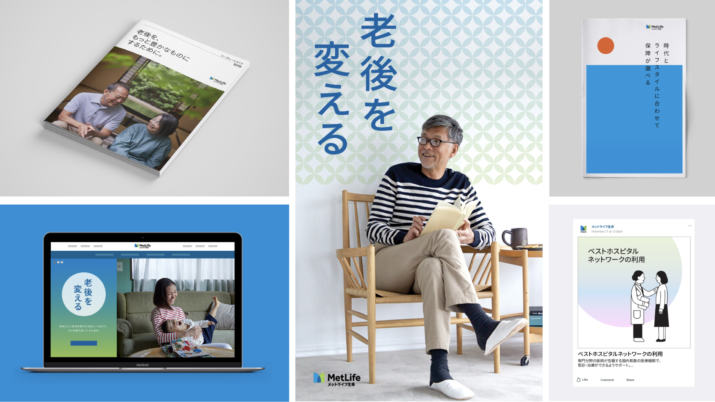

Japan: Finding expression through cultural nuance
A global identity becomes more meaningful when it reflects the culture and visual traditions of the people it serves.
For Japan, the localized design system explored a more nuanced approach to color, pattern, illustration, and photography, creating a distinctive visual language informed by local cultural sensibilities.
The system extended across marketing communications, digital experiences, and customer-facing applications while maintaining a clear connection to MetLife's global brand.


Mexico: Building a vibrant visual language
Localization creates an opportunity to express the personality and energy of a market through design.
For Mexico, the system introduced a vibrant graphic language built around expressive patterns, color, illustration, and imagery inspired by local visual culture.
The resulting approach demonstrated how a shared global identity could accommodate a more distinctive regional expression across communications and digital applications.


Korea: Balancing familiarity and distinction
A localized brand system needs to feel both culturally relevant and unmistakably connected to the parent brand.
For Korea, the creative direction explored a bold geometric language, expressive color combinations, and a contemporary approach to photography and digital design.
The system demonstrated how local creative expression could introduce new visual character while maintaining the foundational principles of MetLife's global identity.


China: Extending the system across experiences
A market-specific visual language must be capable of supporting an entire ecosystem of communications and customer interactions.
For China, the localized system brought together graphic forms, photography, illustration, and digital design to establish a cohesive brand expression across physical and digital touchpoints.
From marketing communications to mobile experiences, the work demonstrated how global brand principles could translate into a flexible and recognizable local design system.

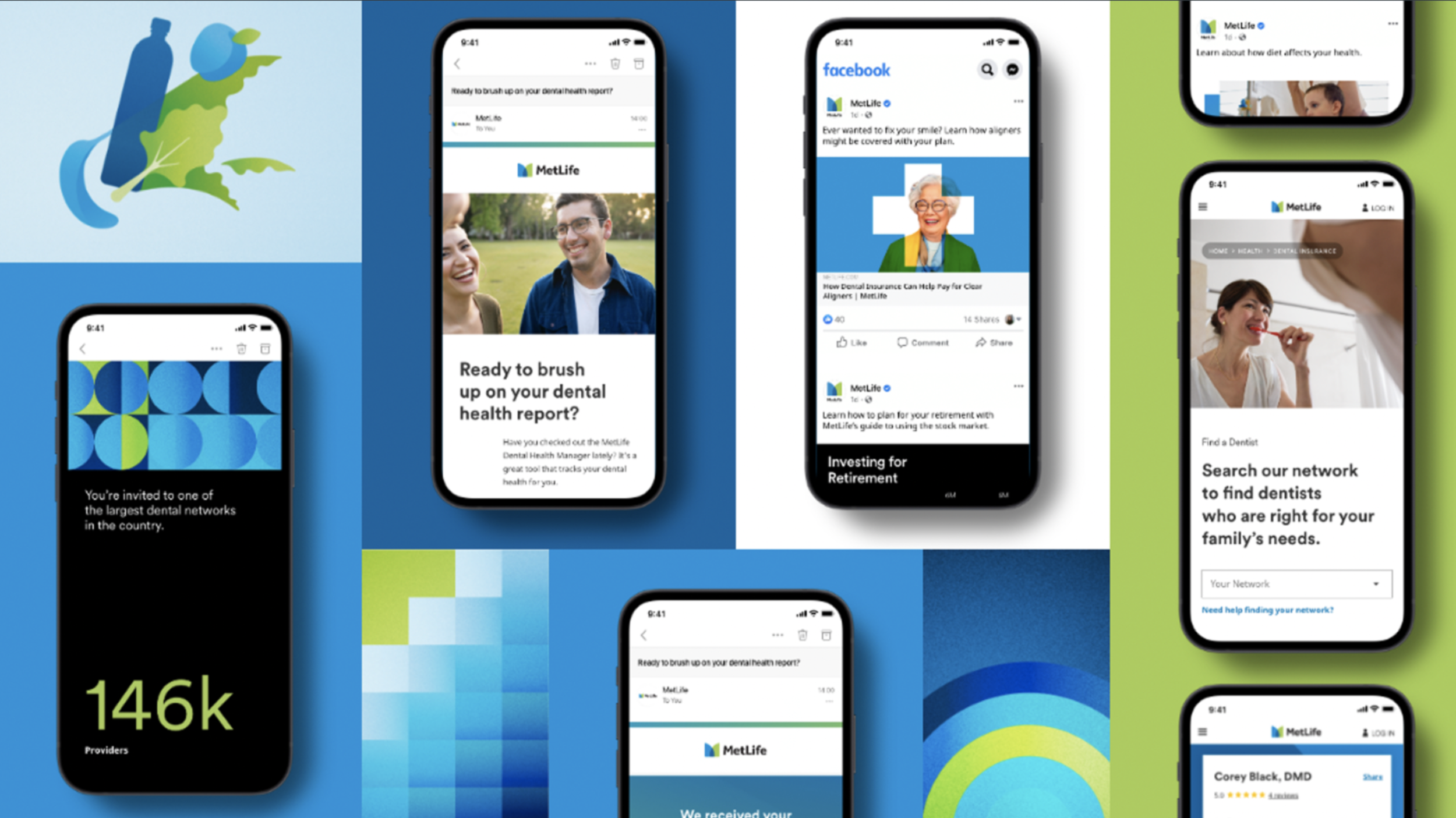
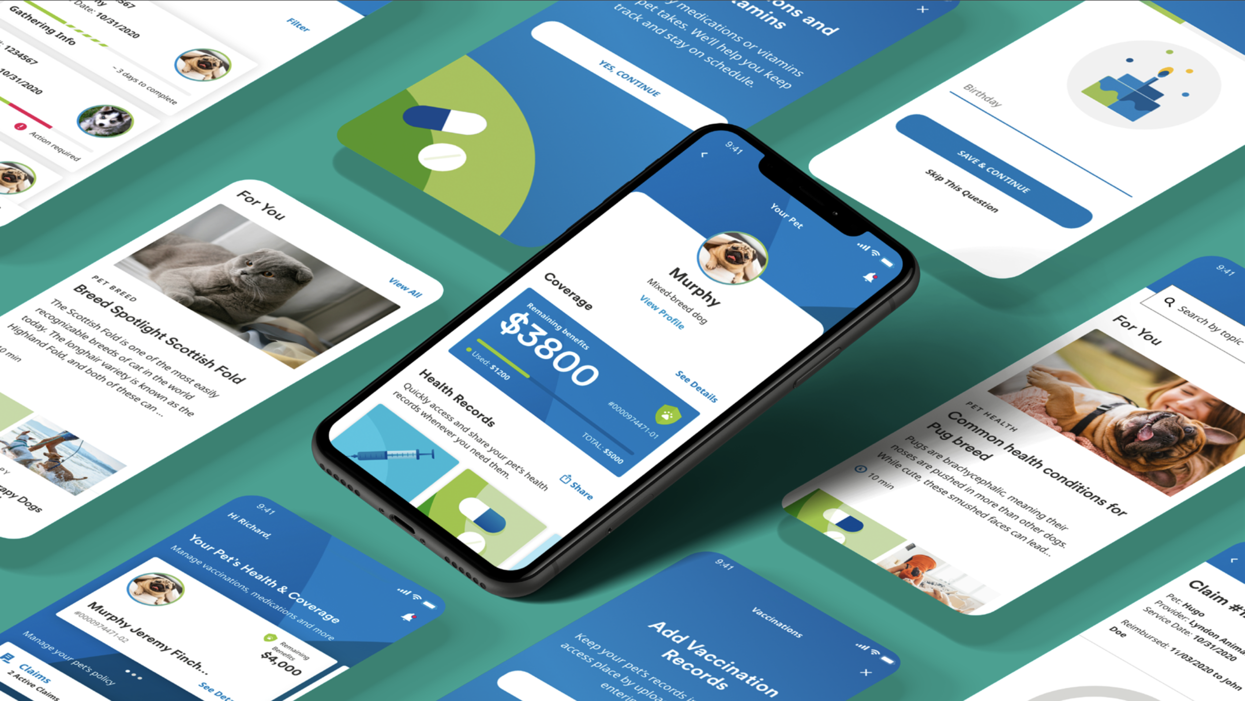

United States: Expanding the brand for new audiences
Localization is not limited to international markets. Even a brand's home market requires the flexibility to evolve its creative expression around distinct audiences, products, and business needs.
In the U.S., the brand system expanded through new graphic approaches, illustration, photography, and digital experiences, supporting a wider range of communications while remaining connected to MetLife's global identity.
One brand, many expressions
The objective of global localization is not to create separate brands. It's to establish a system that can accommodate meaningful differences without losing its underlying coherence.
By developing market-specific creative languages within a shared global framework, the initiative demonstrated how a multinational brand could balance consistency with cultural relevance, empowering regional teams to create work that resonated locally while strengthening the brand globally.