
Polaroid
Polaroid Eyewear came with a remarkable legacy: more than 80 years of innovation in polarized lenses, a name synonymous with color and creativity, and an opportunity to build a more distinctive presence in the global eyewear market.
Working at Ming, we developed a new visual identity and comprehensive brand design system that brought these qualities together. The approach combined Polaroid's iconic color heritage with a contemporary graphic language, establishing a flexible foundation for advertising, digital communications, retail environments, and brand experiences.

A colorful foundation
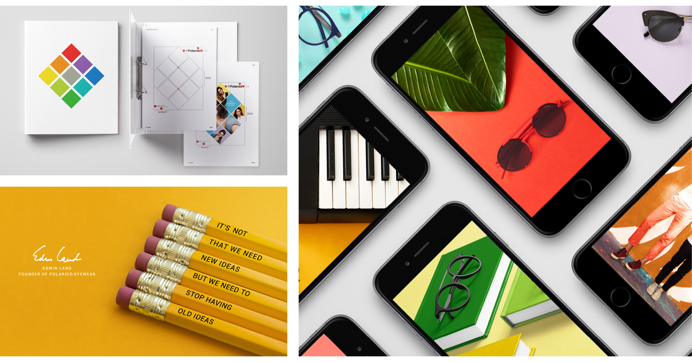
Color became the organizing principle of the identity, drawing on Polaroid's heritage while establishing a contemporary visual vocabulary for the eyewear brand.
We developed a modular graphic system built around a distinctive spectrum of color, geometric compositions, typography, and photography. These elements provided the structure for a recognizable identity while allowing the brand to express itself across different audiences, products, and environments.



Bringing the identity to life
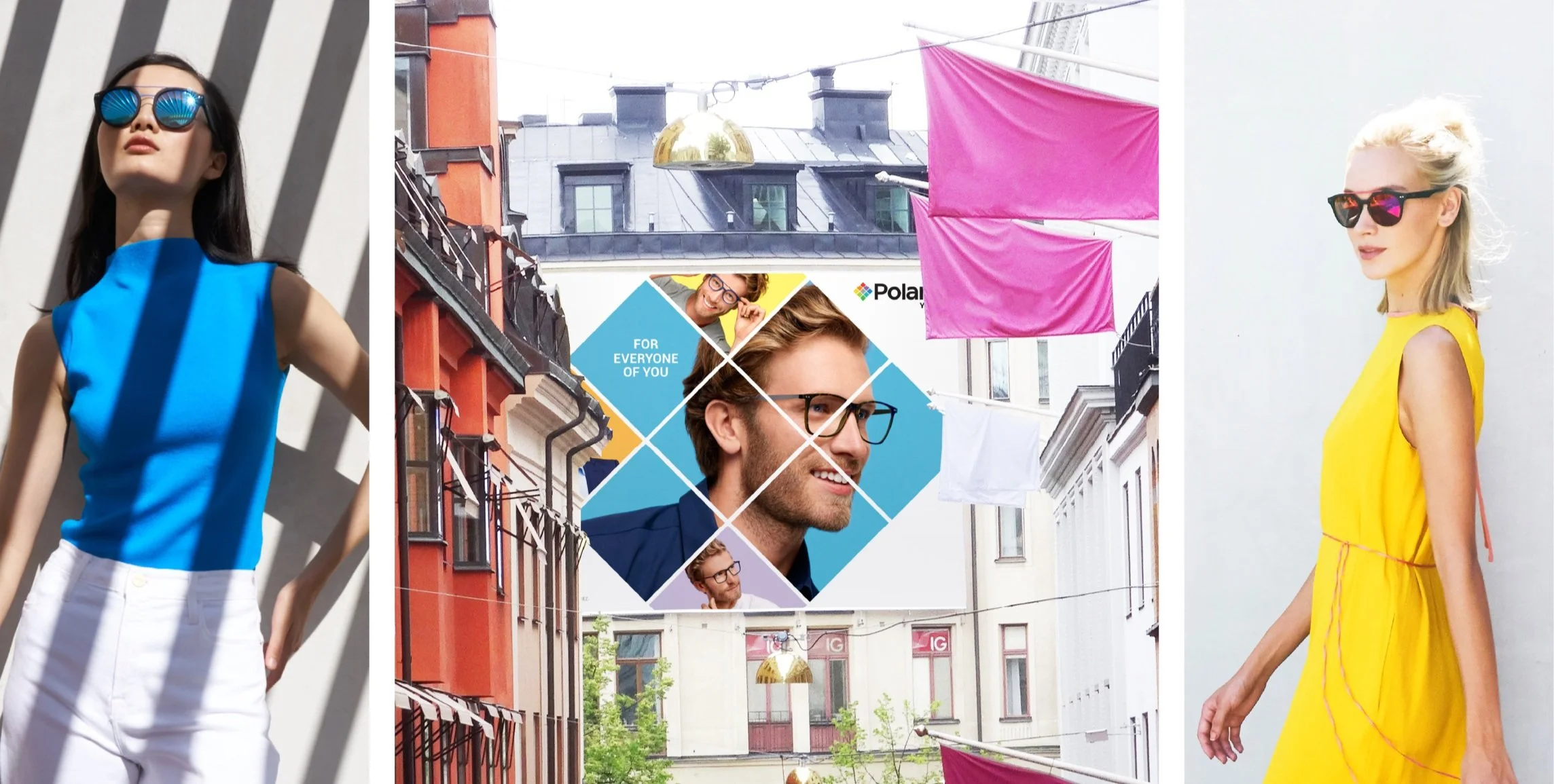
The design system extended into a broad range of brand applications, from advertising and digital experiences to retail communications and environmental graphics.
Photography, color, and geometric framing worked together to create a distinctive visual language that could accommodate both product storytelling and lifestyle imagery, giving Polaroid Eyewear a consistent yet adaptable presence across touchpoints.

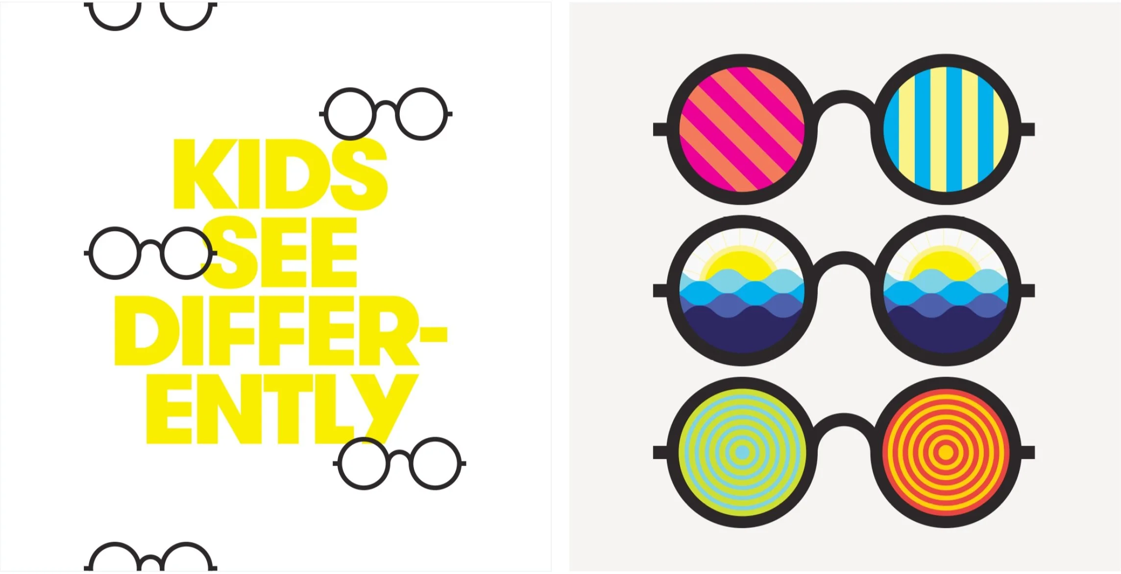
Creating Kids Only
The work also led to the development of Kids Only, a dedicated eyewear brand for children.
Building on the expressive potential of the Polaroid color palette, we created a bespoke identity designed around a playful typographic system, bold graphic patterns, and a visual language inspired by the way children see and experience the world.
The resulting system introduced its own distinctive character through imaginative graphics, eyewear-inspired motifs, and energetic color combinations. Applied across packaging, advertising, merchandise, and retail communications, Kids Only established a recognizable identity designed specifically for a younger audience.
This work was conducted by Brad Blondes in his role as Partner and Chief Design Officer at Ming, supported by the design team under his leadership.