

Guardian
Insurance
We partnered with Guardian's in-house creative team to help meet the growing demands of a complex, established insurance brand.
As the volume and variety of communications increased, the challenge was to deliver high-quality creative work consistently across products, audiences, and channels. Working within Guardian's existing brand framework, we provided creative direction, design expertise, and scalable tools that helped the internal team expand its capabilities while maintaining a cohesive brand experience.
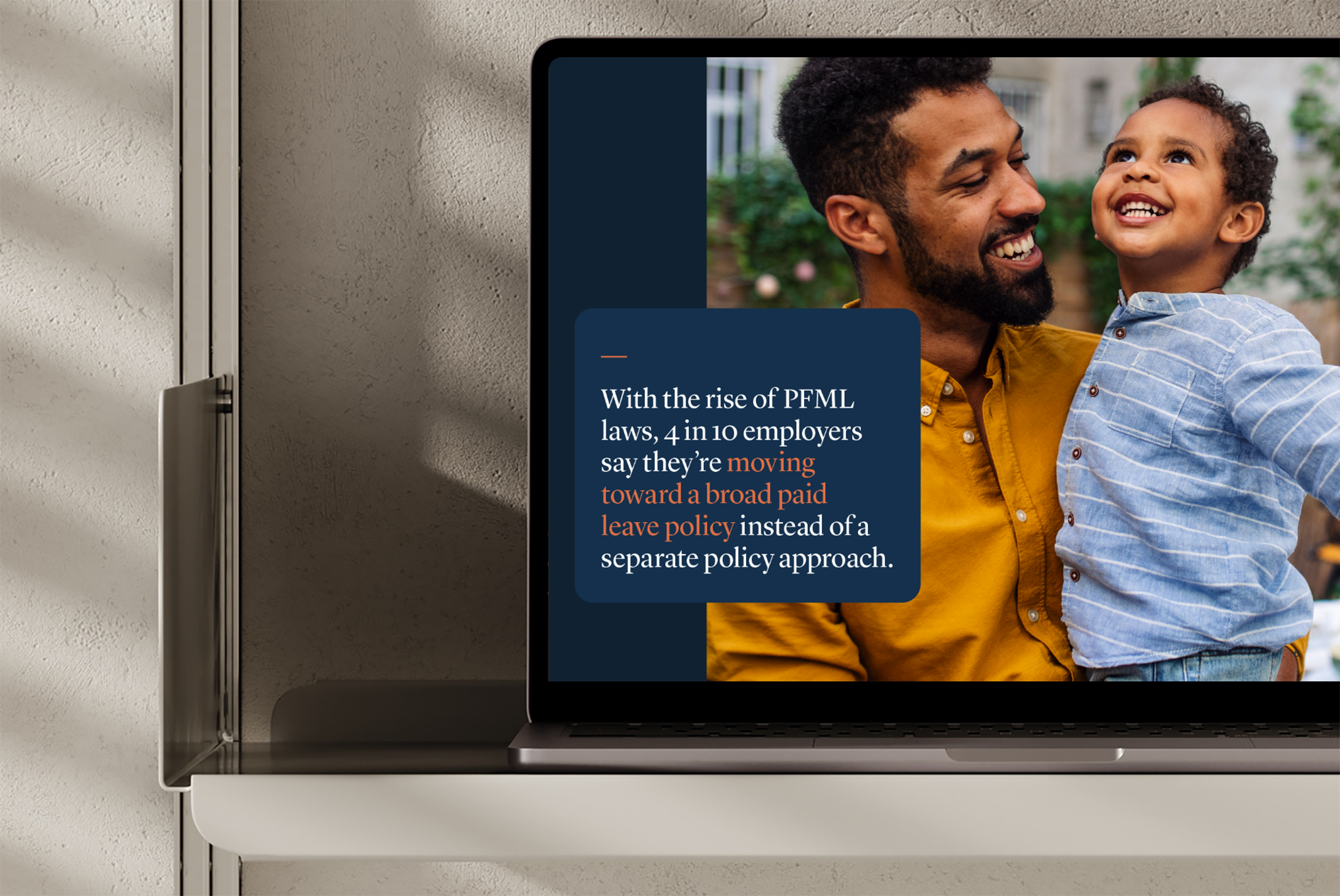
Building better digital sales tools
Effective sales communications need to make complex products and information easy to understand.
We developed digital sales tools that brought together clear information hierarchy, purposeful imagery, and consistent visual design, helping Guardian communicate its offerings through more engaging and accessible experiences.

Creating a language of icons
A comprehensive product portfolio requires a visual language that can communicate across a wide range of offerings.
We developed bespoke iconography for Guardian's products and solutions, establishing a consistent approach to form, detail, and visual expression. The resulting system made complex insurance concepts easier to navigate while reinforcing the broader brand identity.

Enabling consistency at scale
The value of a design system lies in its ability to guide everyday creative decisions.
We developed guidelines and toolkits that translated Guardian's brand standards into practical resources for internal teams, supporting consistent execution across communications while providing the flexibility to address different business needs.

Making data meaningful
Complex information becomes more useful when it is structured and communicated clearly.
We applied Guardian's visual language to data visualization and information design, creating accessible, consistent ways to present research, insights, and business information across communications

Bringing humanity to the brand
For an insurance company, the relationship between people and protection is central to the brand story.
Through art direction and imagery, we helped create a more relatable and expressive visual language, connecting Guardian's communications to the people and experiences behind its products.

Building a system for events
A year-round event program requires more than a collection of individual designs. It needs a flexible identity system capable of creating consistency across different audiences, occasions, and environments.
We developed a comprehensive event design system for Guardian's annual program, establishing a recognizable visual language that could adapt across multiple events while maintaining a cohesive connection to the master brand.
Explore how 4East builds flexible brand systems that support consistent creative execution.